Installation


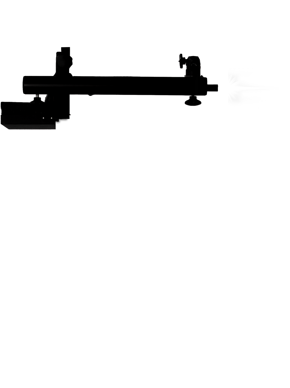
1 Wireless Mouse
The optical sensor of the hidden mouse detects movement of the arm and sends the input to the computer.
2 Movable Arm
The arm of the tripod is the primary human-machine interface. The user can move it up or down to move forwards or backwards in time and see the ice cap changing over the past decades.
3 Computer
The input from the mouse is being processed by a hidden laptop where a Java program renders the images and sends the output to the monitor.
4 Monitor
Upon moving the arm the monitor shows the user the corresponding year and extent of the ice cap.
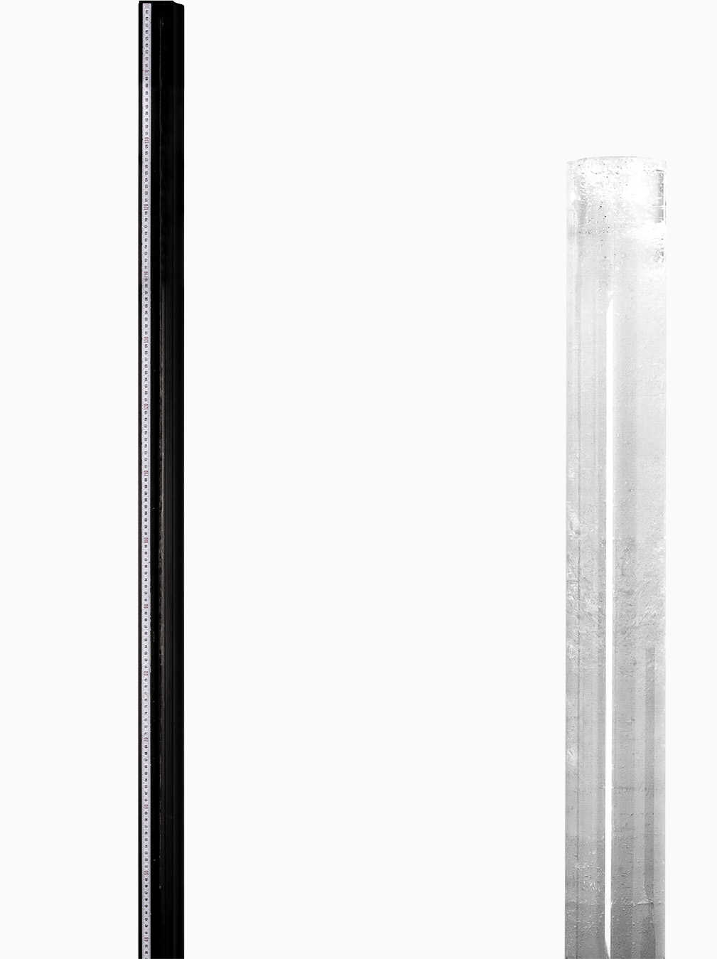
5 Ice Core Sculpture
30 liters of molten candle gel were poured in a 1.8-meter tall plexiglass cylinder. The sculpture looks identical to real ice cores used in scientific research for climate change.
Method
Source
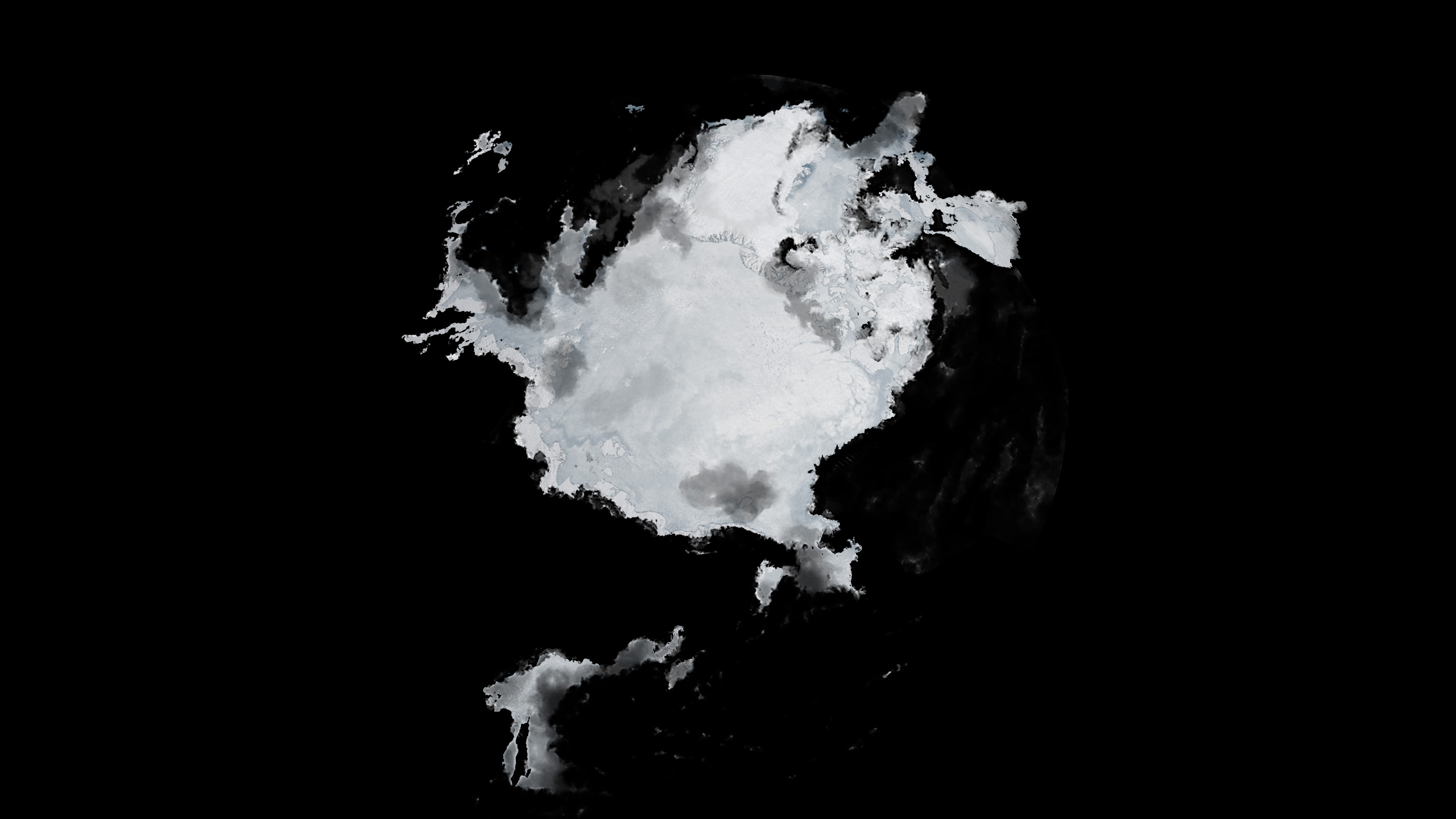
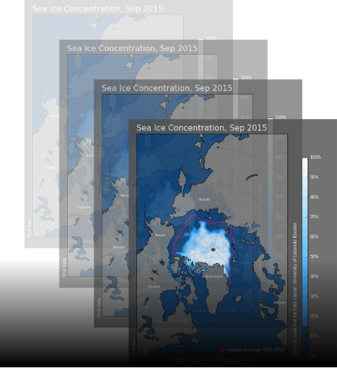
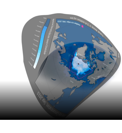
Satellite Data from NASA and NSIDC, provided by the University of Colorado, are crawled and sorted. Thousands of maps from 1979 to 2019 show the extent and density of the north polar ice cap.
Mapping
The data is projected to a globe as accurately as possible. Reducing the opacity allows a precise tracking of the borders.
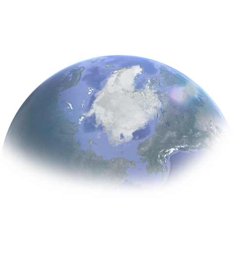
Illustration
The map is being digitally retouched to give it a photorealistic look. Besides the the ice cap's extent, its density is visible as well thanks to varying opacity levels. The accuracy of the borders in the final image is <Δ300km compared to the original data.